Nassim Park Residences
The Brief
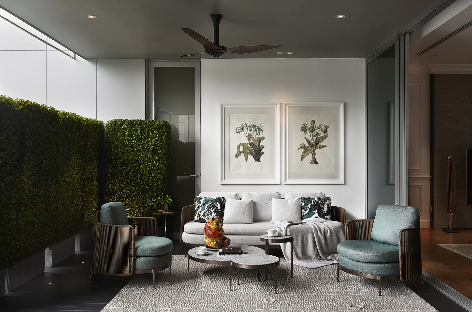
When the owners first moved into this 3,466 sq ft French-styled apartment, they had a clear vision: the living spaces felt disconnected from the terrace—it was treated as an afterthought, not part of the home.
The outdoor terrace was a valuable asset, but felt like a different room. The challenge wasn't decoration—it was making the terrace feel like a genuine extension of living, not a separate zone.
Our Thinking
In a space this size, you have room to think carefully about flow. We started by asking: If the terrace is going to be truly part of daily life, what needs to change?
This meant rethinking how the interior connects to the outside. We removed the threshold between interior and terrace flooring.
Every decision was about making the terrace psychologically part of the home, not physically separated from it.
Living + Dining + Outdoor
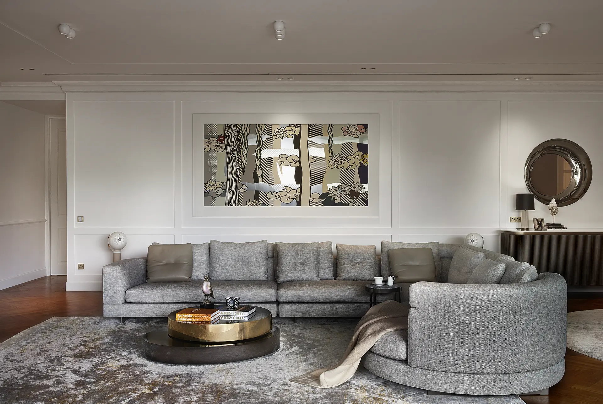
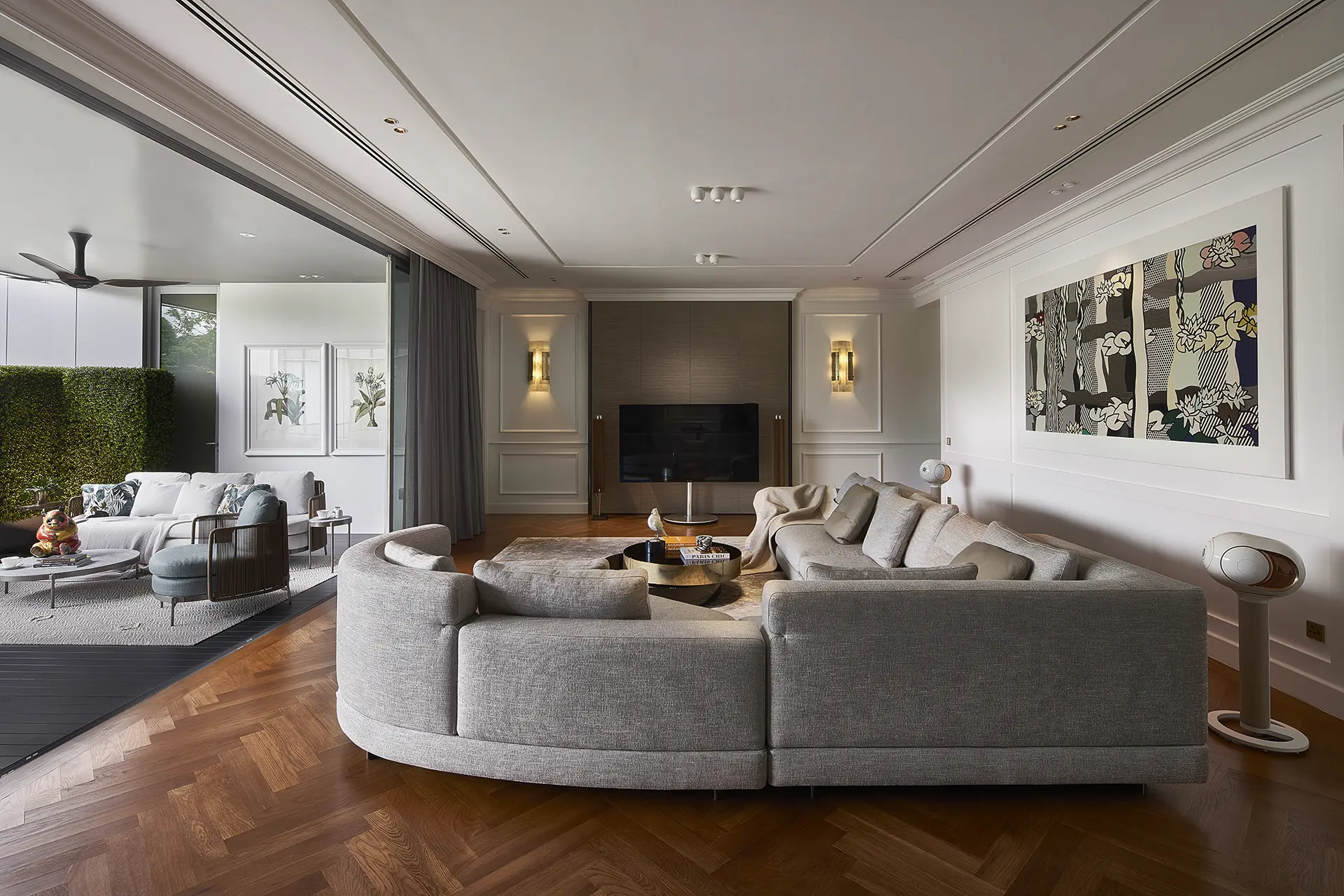
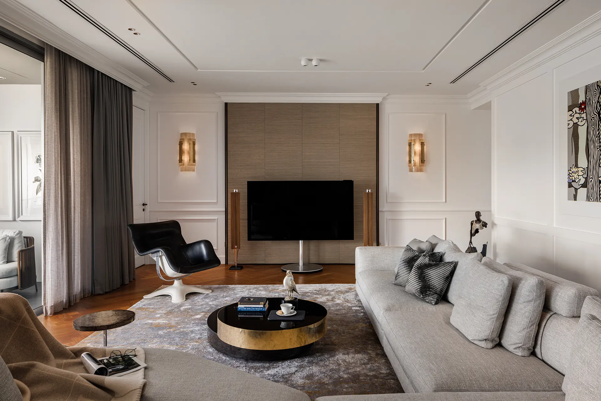
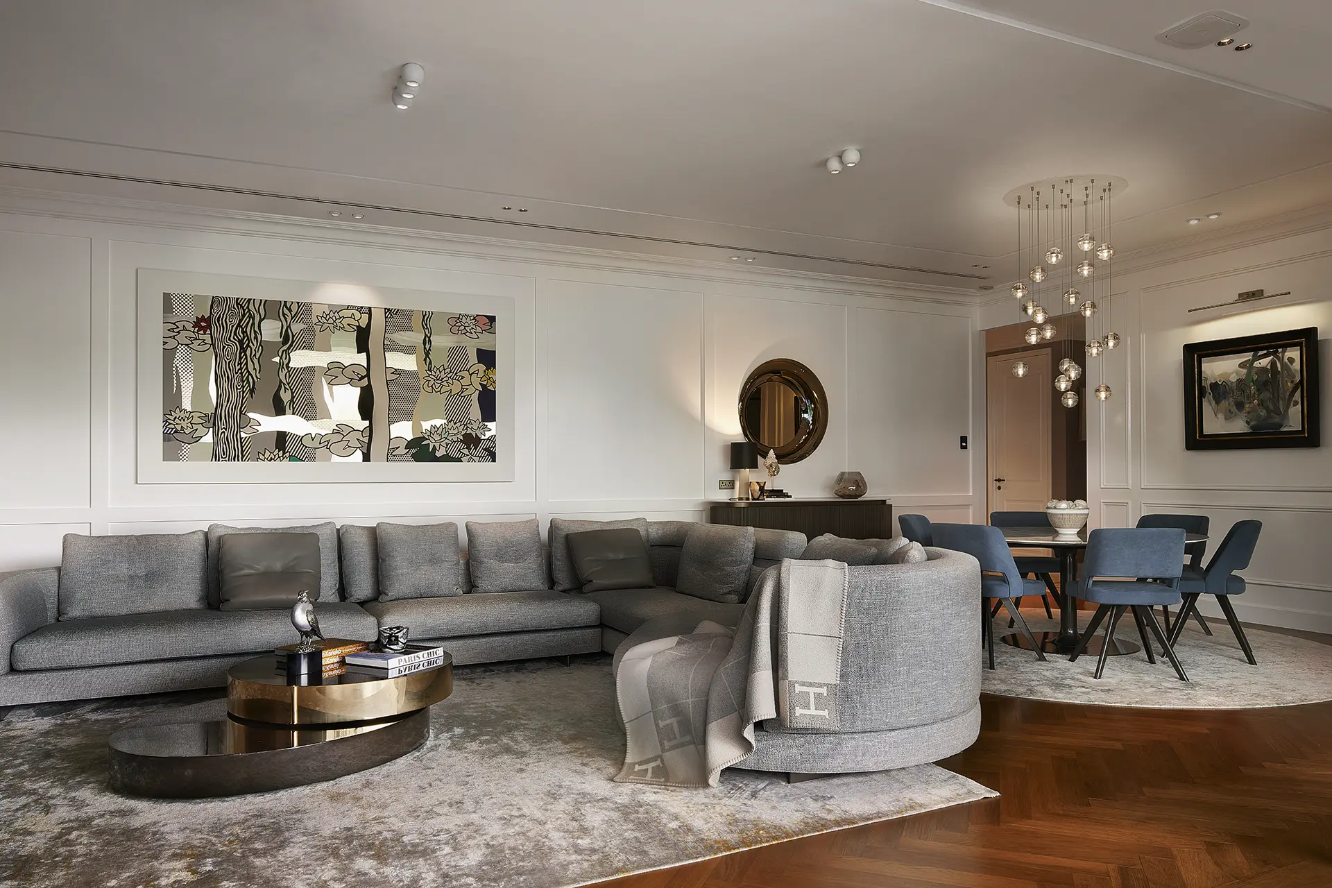
This is the heart of the apartment, and where the terrace connection matters most.
The Space
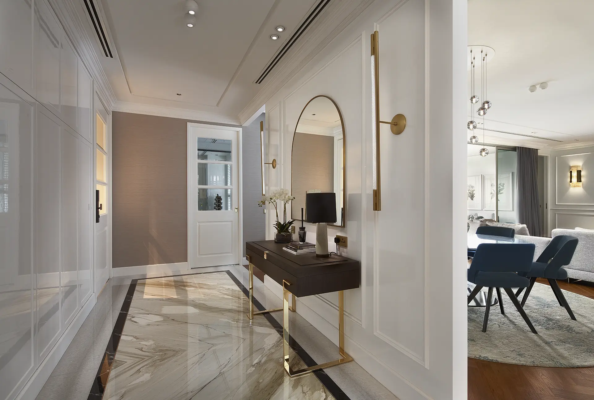
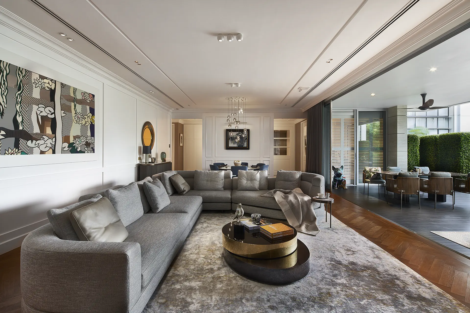
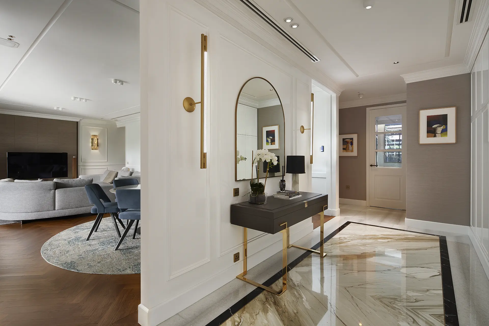
We opened up the original layout, removing a wall between living and dining to create one continuous open-plan space facing the terrace. This eliminates the visual fragmentation that made the terrace feel distant.
Seating & Flow
The Minotti Alexander sofa was positioned perpendicular to the terrace doors, so anyone seated is naturally oriented toward the outdoor view. The low-profile design means sightlines from the seated position aren't blocked—you're looking through to the terrace, not at a wall of furniture, you're engaged with the terrace while inside.
The material was chosen for its ability to withstand direct light exposure for extended hours daily without fading. It also develops a subtle patina over time that improves its appearance, this terrace-facing sofa gets 6+ hours of direct sunlight daily, so durability mattered more than initial appearance.
Dining Connection
The Minotti Oliver dining table is positioned at the threshold between living and balcony, so meals can flow seamlessly to the outdoor space. The Bocci pendant floats above, creating an intimate overhead moment that doesn't block the view outward, just frames the dining zone within the larger open plan.
The Lichtenstein Print
The Water Lilies with Willows print hangs in direct sightline from the main seating area, creating visual flow between interior art and the actual botanical landscape visible through the terrace doors. It extends the palette and narrative outward.
Flooring Transition
We selected the same natural stone for both interior and exterior, with a subtle slope for drainage. This eliminates the visual and tactile break—when you step onto the terrace, you're stepping on the same material, in the same tone, creating psychological continuity.
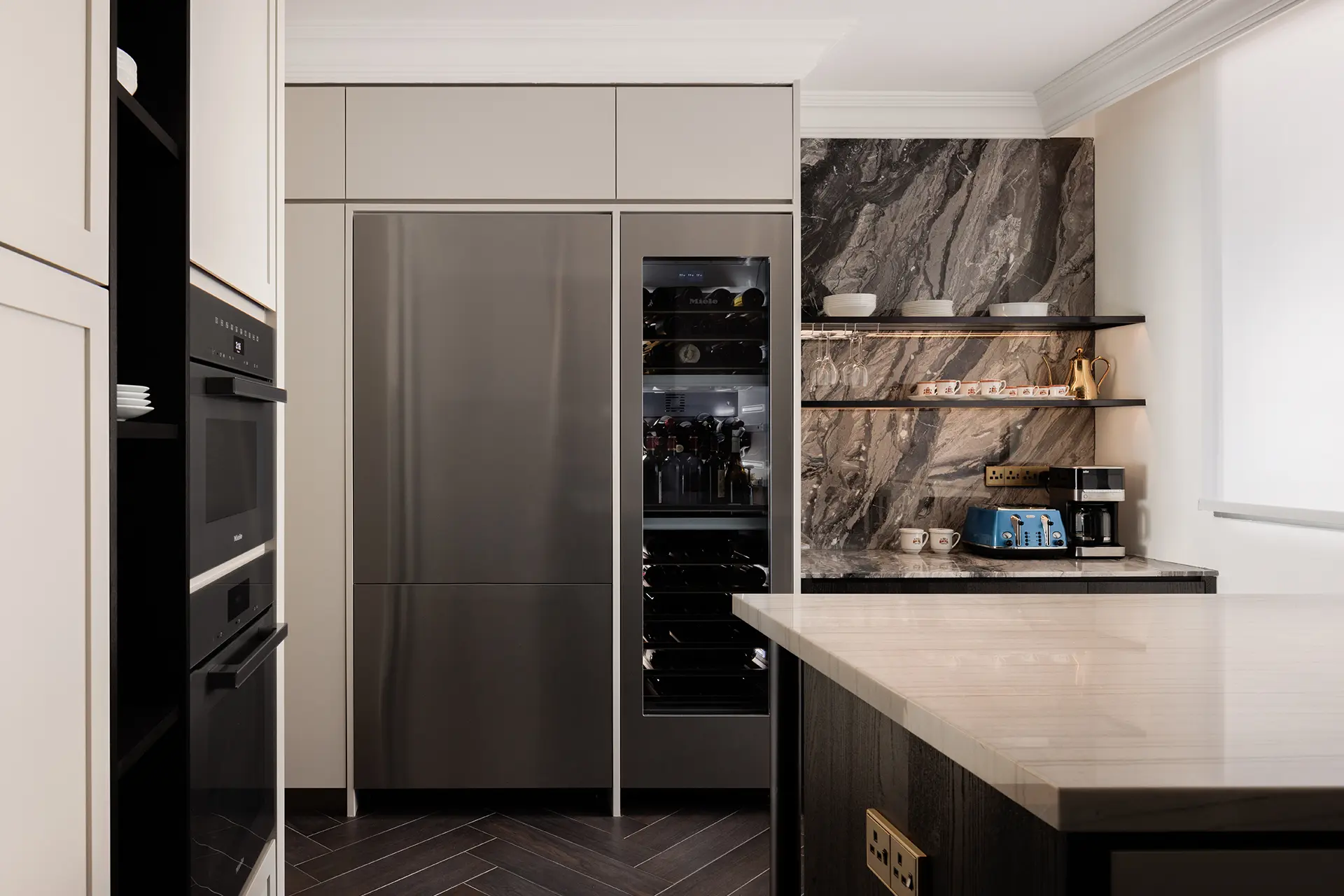
Kitchen
Workflow Function
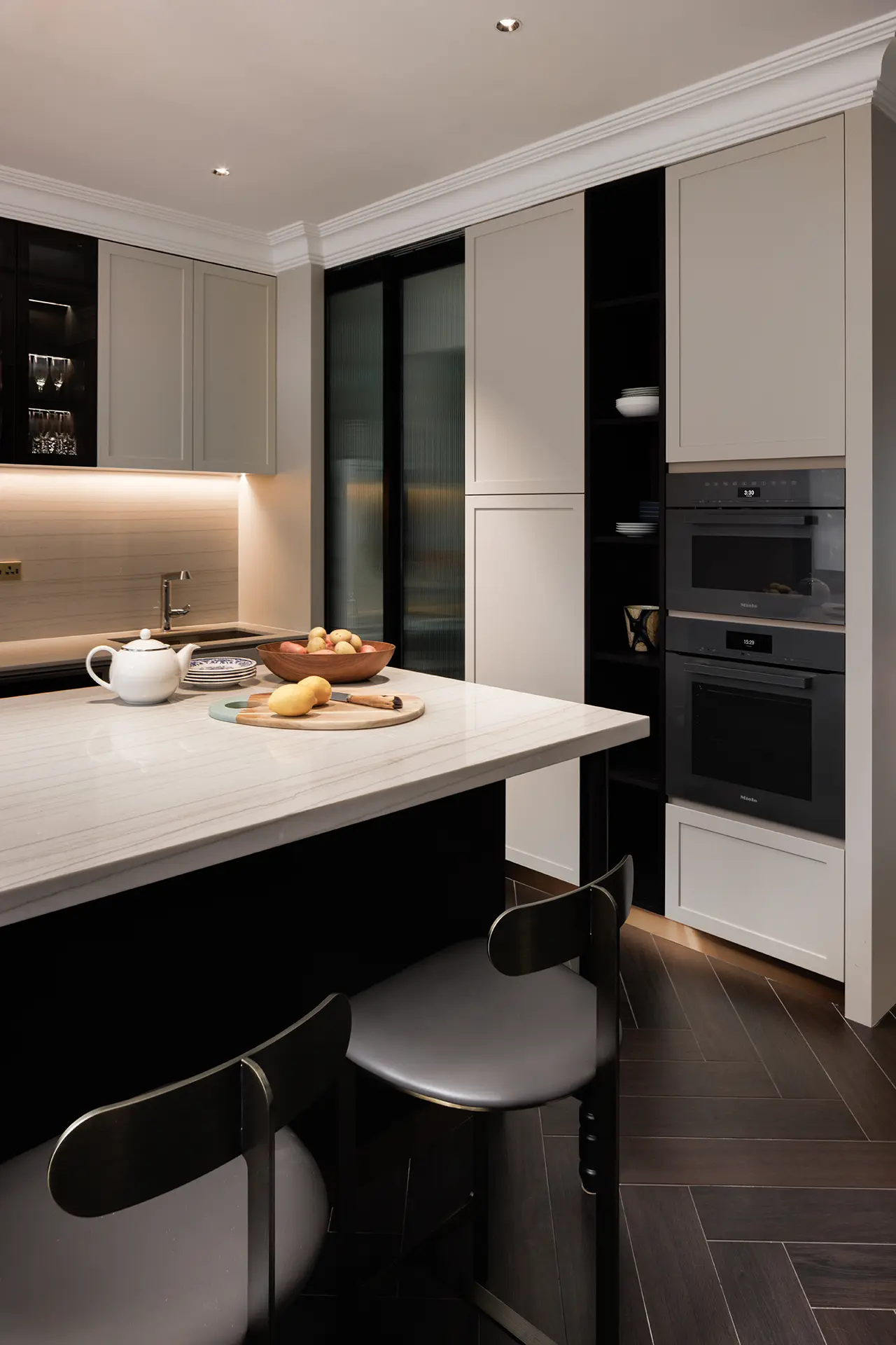
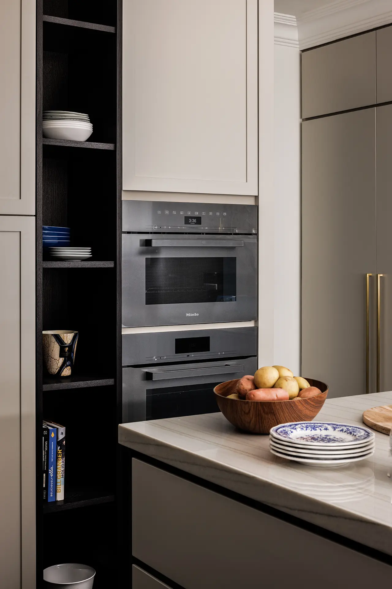
The kitchen is positioned off the main living area, closed. We kept it integrated so it doesn't compete with the terrace views. Materials were chosen for aesthetic & functionality. The layout supports workflow consideration.
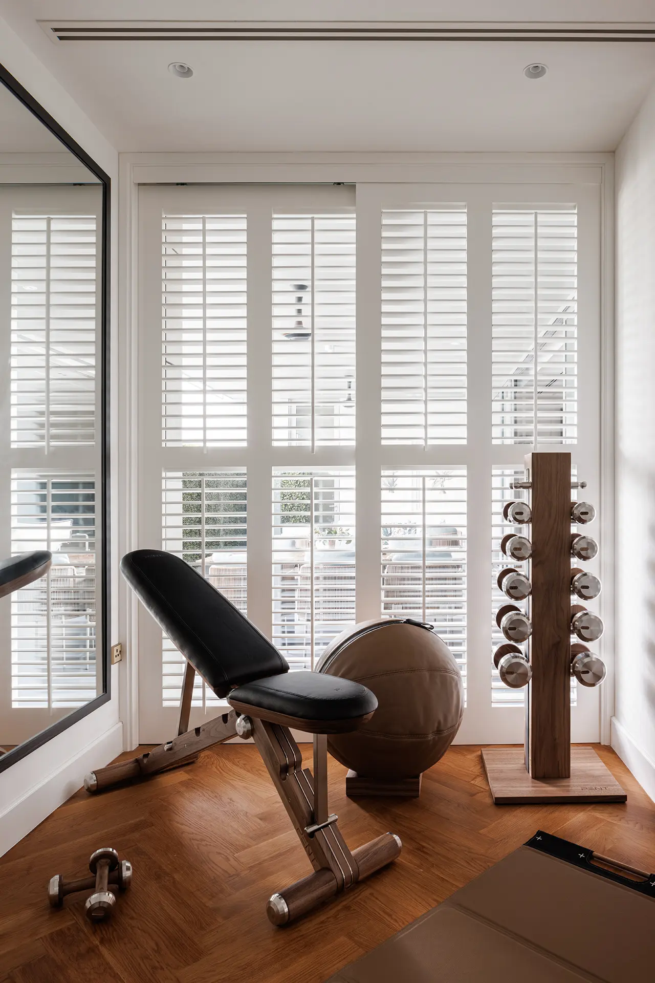
Gym Room
Functional Room
The gym is positioned with floor-to-ceiling windows fitted with white horizontal shutters. This is the most important detail: the shutters allow natural light to flood the space while maintaining privacy and controlling glare on exercise equipment. The light filtering through the shutters creates a rhythm across the room.
Master Bedroom + Bathroom
Space Functions
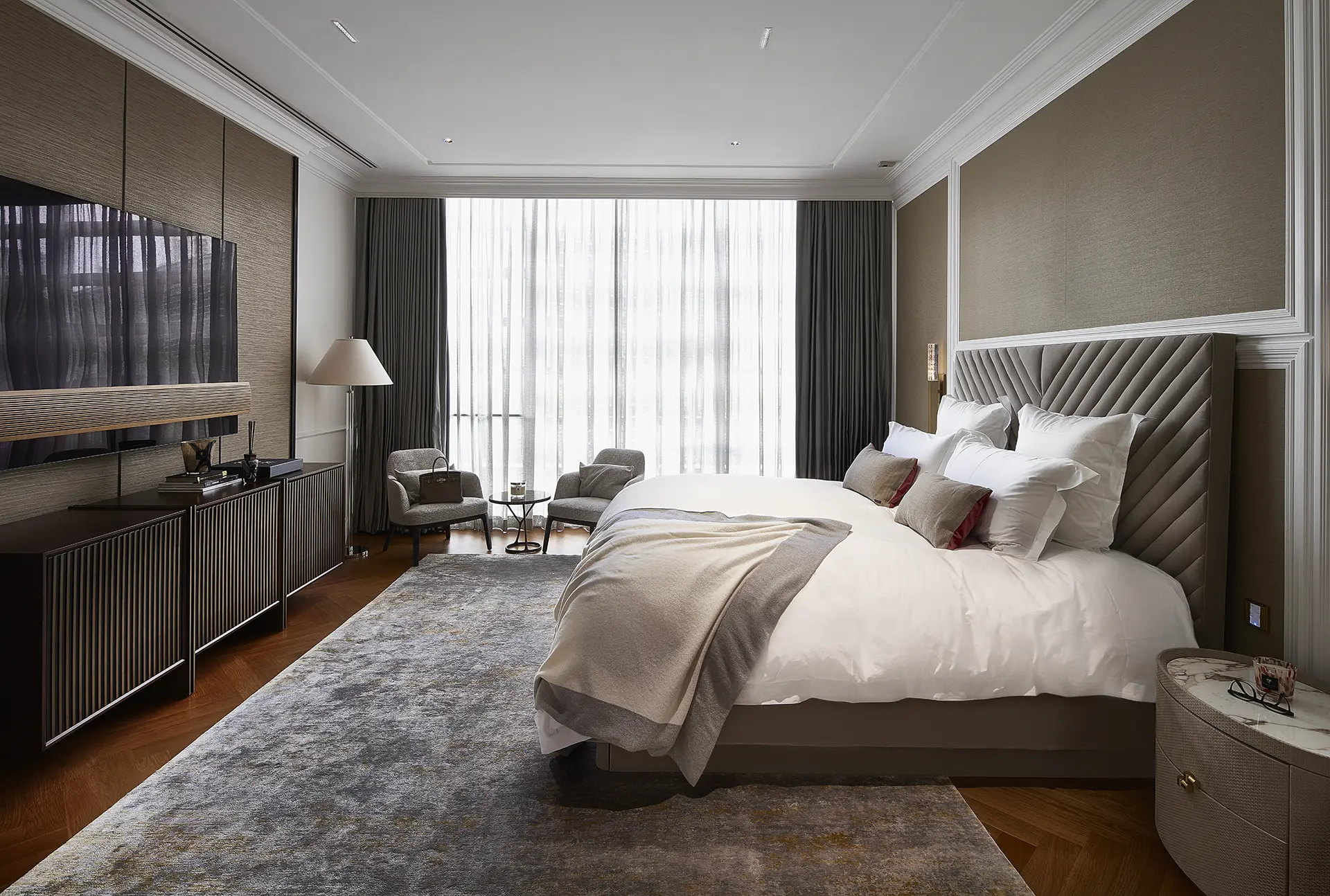
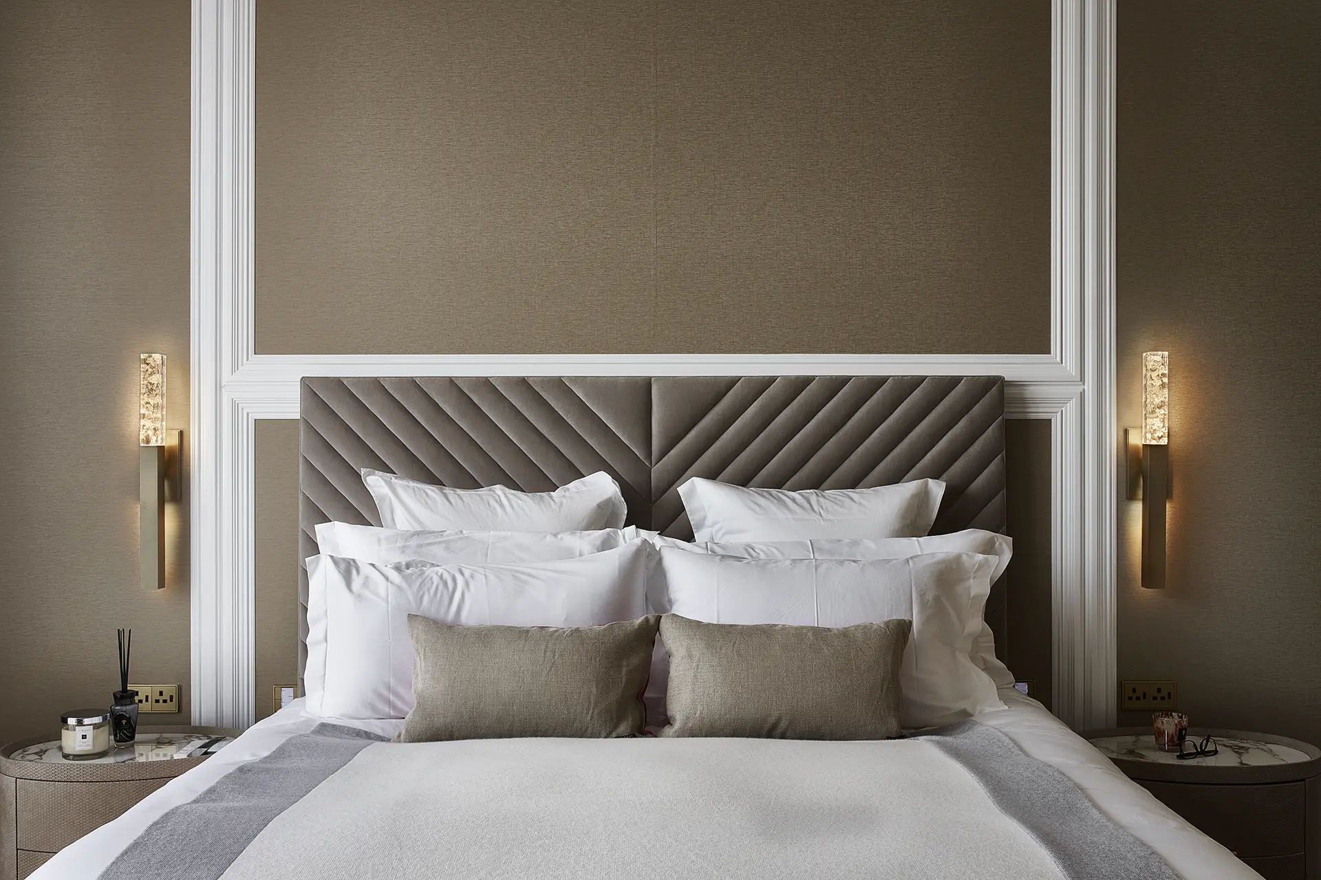
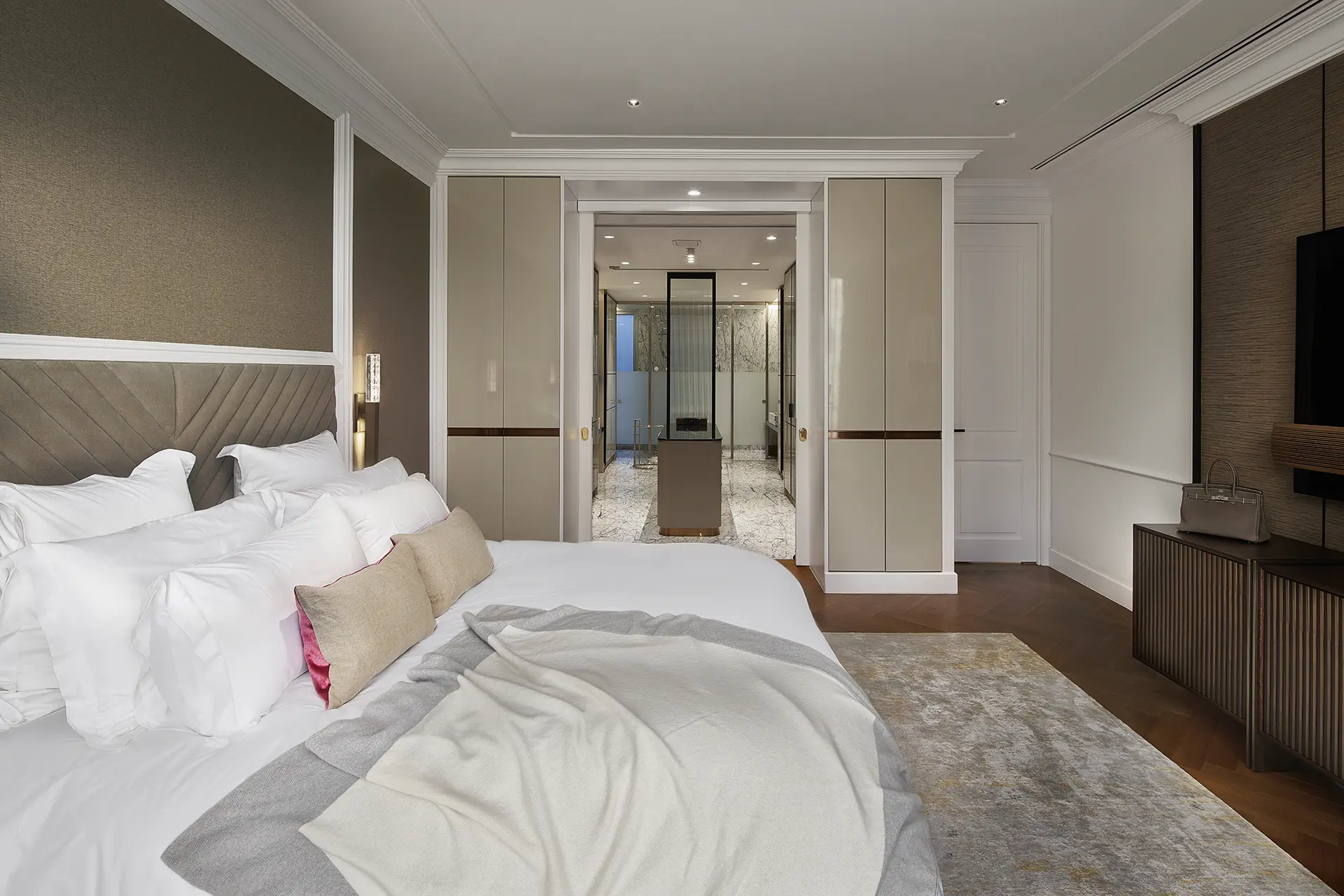
The master suite is positioned with expansive windows overlooking the city, flooding the space with light throughout the day. The material palette shifts to warm, intimate tones—warm wood flooring, soft gray textured walls, an upholstered headboard in soft gray—creating a private retreat while maintaining design cohesion with the rest of the apartment.
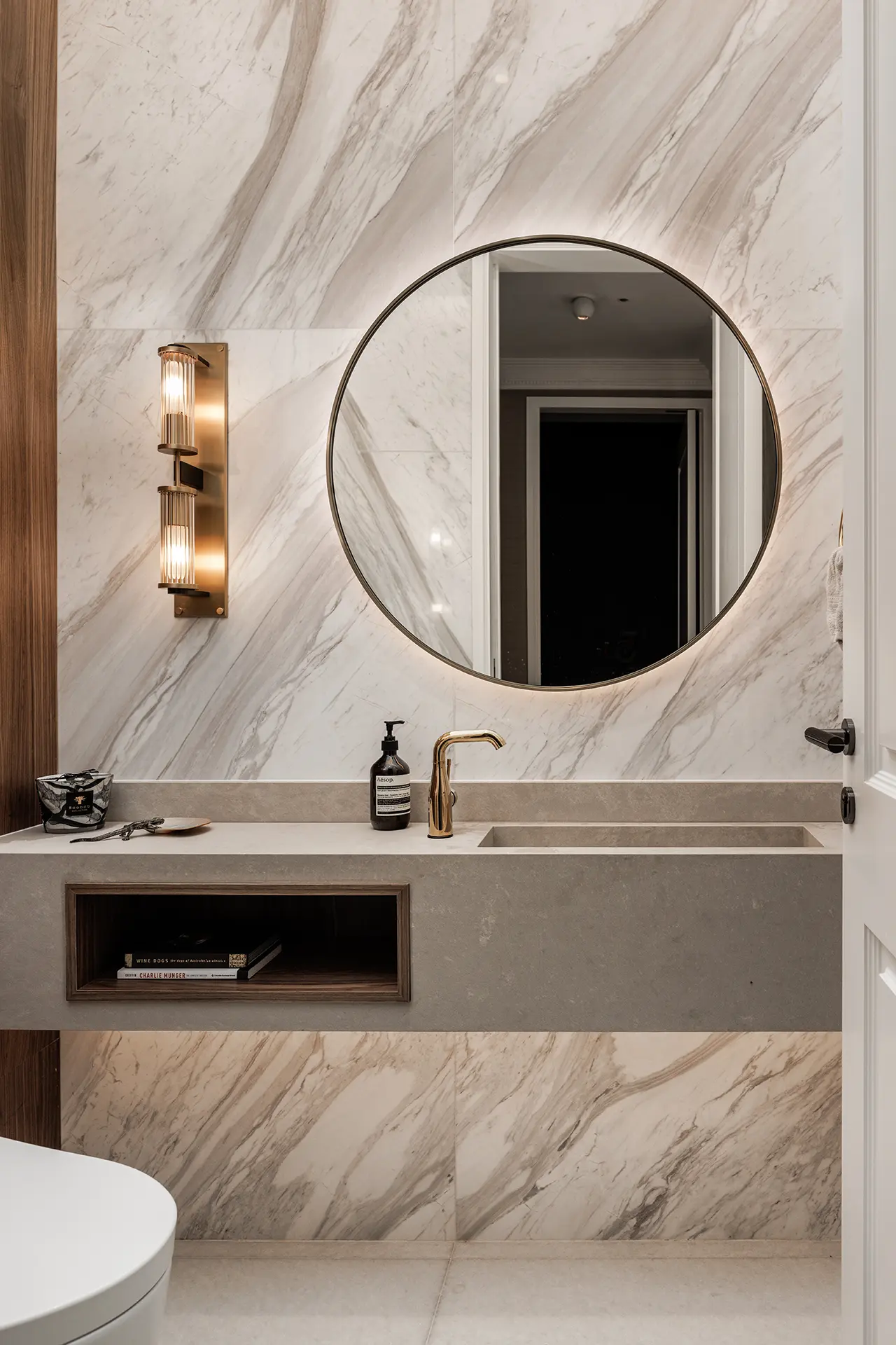
The ensuite bathroom is pure refinement. Marble walls with dramatic veining become the entire story.
Bedroom
Flexibility
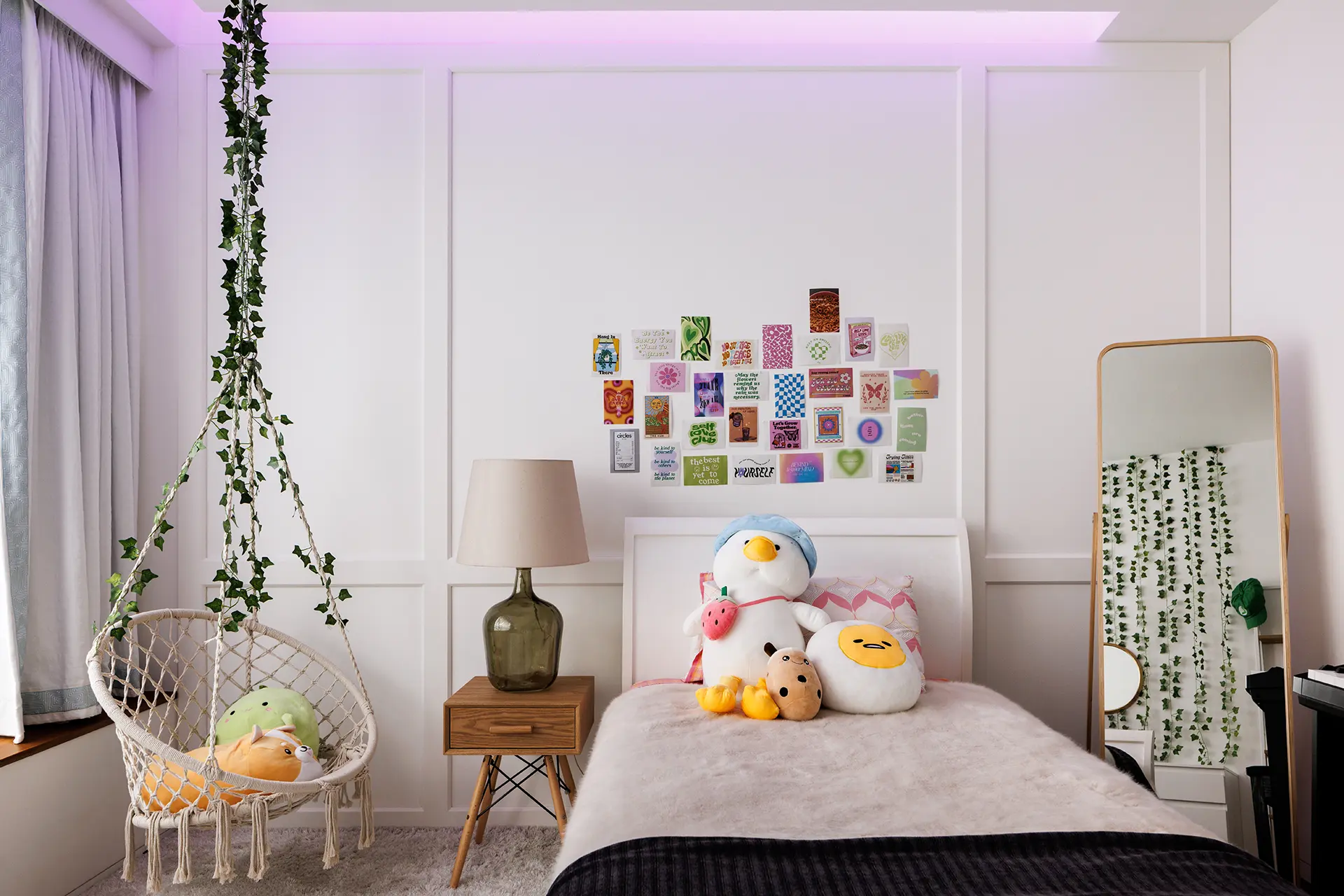
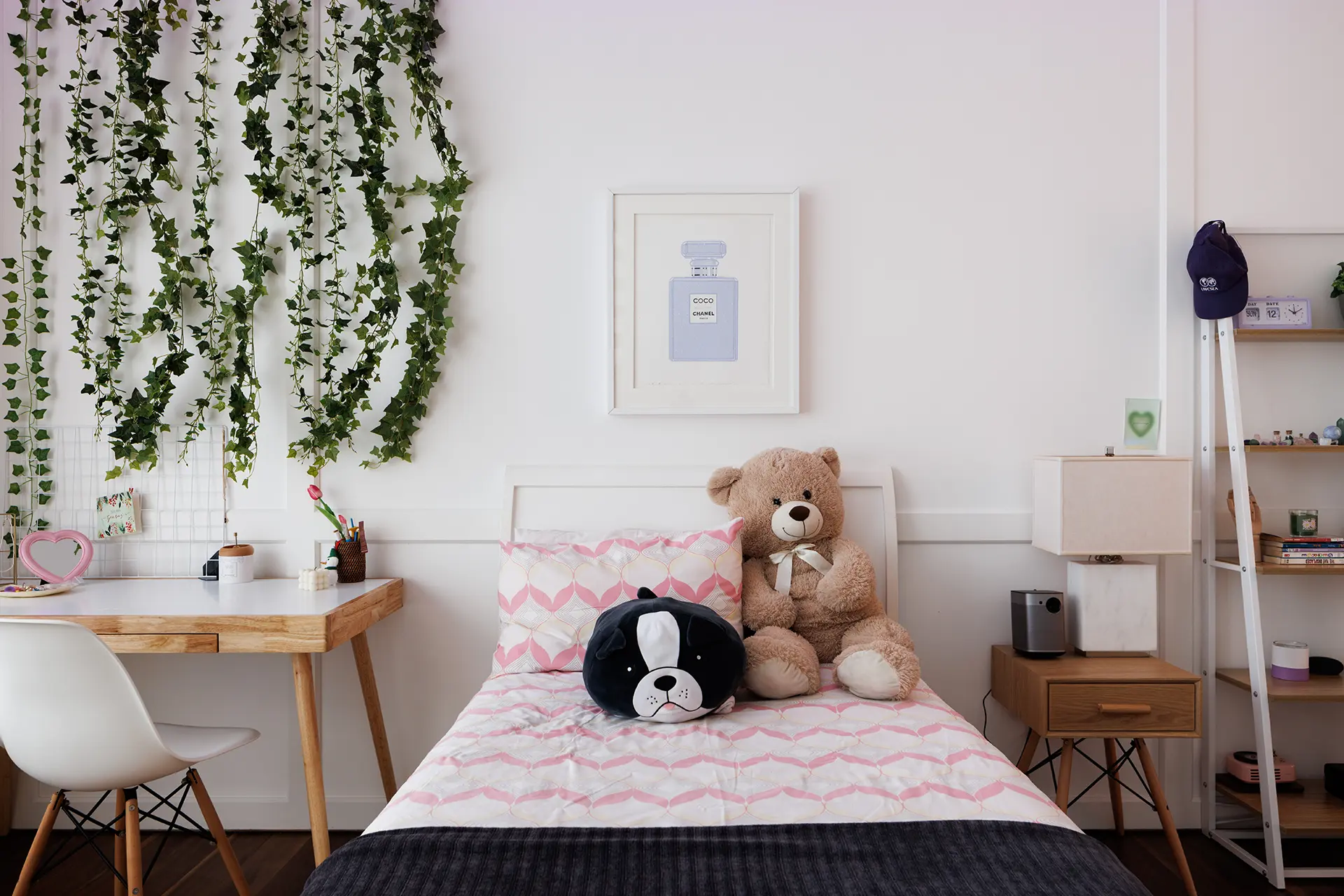
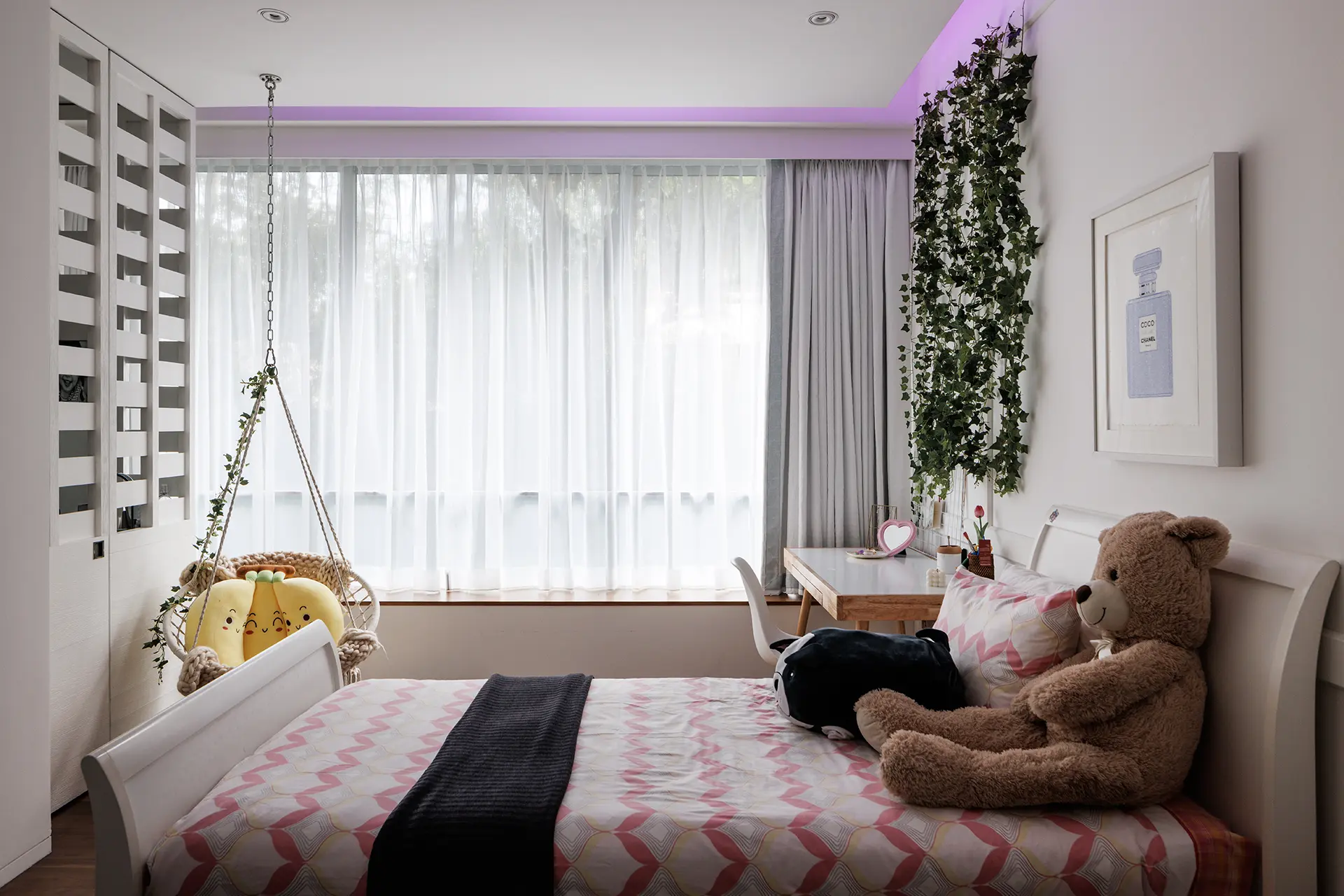
The secondary bedroom is designed for flexibility. The window receives consistent natural light, and the room's proportions feel intimate without being cramped. The material palette is lighter here—whites and soft tones dominate. This space can serve as a guest room or a child's bedroom, so design decisions prioritize adaptability while maintaining quality.